
Putting your business out in the online world takes lots of work. Online ads, website design, social media — all of these elements can help you reel customers in. However, there’s one thing that some brands tend to look past when it comes to sales: user experience (UX).
UX describes the impression a customer gets after interacting with your site, and it covers ease of use, accessibility, and value. UX design incorporates these elements into a site, making UX extremely essential to greater sales.
Sadly, not all businesses pay attention to UX. Limited time, lack of budget, and the overwhelming features that come with a UX-optimized site are some reasons why brands take UX for granted. But every business should prioritize UX for their site because it can help them create a site that puts customer needs first.
More importantly, you can make your store stand out and boost its conversions with good eCommerce UX.
The Benefits of Good E-Commerce UX
A higher conversion rate isn’t the only benefit you can get from improving your E-commerce website’s UX. Better UX can help you:
- Spend less on customer support and acquisition
- Gain more referrals from your customers
- Get happier buyers and more repeat sales
That said, let’s look at some UX best practices you can use for increasing your sales.
Create a Clean & Simple Homepage
When customers click on your website, they’ll see your homepage first. This page often gains the most traffic, so creating a clean, clear homepage is essential.
Remember: making a good first impression takes approximately 0.5 seconds. Even a simple homepage can “wow” shoppers at that split second.
For your homepage to impress your customers, keep these tips in mind:
- Apply a clean and minimalistic web page design.
- Make your offers, blog posts, and other dynamic elements the highlight of your homepage.
- Keep your color scheme consistent.
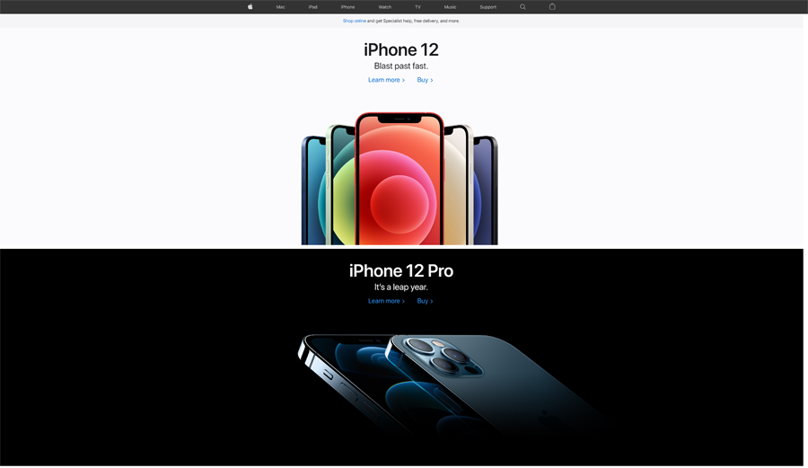
Screenshot from Apple
Apple has mastered the art of designing a clean, simple homepage. The brand’s homepage puts its products (in this case, the iPhone 12 series) front and center. You won’t see anything else, just clear photos and short descriptions of the tech giant’s offerings.
Make Browsing Easier for Your Customers
Good website UX is more than keeping your site design simple. It also covers how your customers browse your site. A complicated browsing experience can make users leave your site, and you wouldn’t want that to hurt your bottom line.
If you’re after simple navigation, here are some tips to follow:
- Put the focus on your call-to-action (CTA) with strong visual cues, like contrasting colors and arrows.
- Use columns and sidebars to sort your products.
- Include a search bar. This way, your customers can easily find an item they want.
- Make sure the names of your products are clear so they’re searchable online.
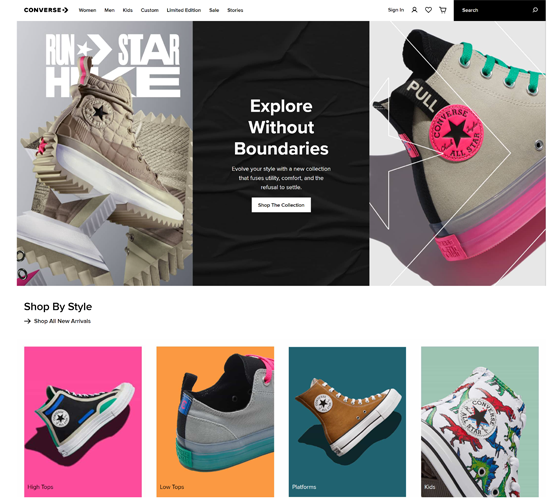
Screenshot from Converse
Converse’s homepage gets all the above-mentioned elements down pat. First, it’s got a search bar where shoppers can type their search queries. The page also gets plus points for its standout CTA.
Scroll a little further down the page and you’ll see a Shop By Style section. Each shoe style is displayed in a single column, making the section look organized. Plus, the brand uses familiar words for the featured styles — high tops, low tops, platforms, and kids.
Improve Website Speed
Two seconds is the ideal load time for an E-commerce website. If it goes over that period, your bounce rate may increase. After all, if your site takes too long to load, online shoppers may choose to move to a different website instead.
More than that, an E-commerce website that fails to load could make it lose up to $2.5 million in sales — if it makes a $100,000 daily profit. So with better site speed, you can keep driving your sales up and encouraging shoppers to stay on your website.
You can boost your online store’s speed in several ways. Compressing your website’s files is one way to achieve faster loading times. After all, this results in fewer and smaller files. On a similar vein, removing excess formatting, whitespace, and code, plus merging CSS and JavaScript files into one can help speed up your website.
Apart from the tips we’ve mentioned, you can follow these steps to increase site speed:
- Cut down on HTTP requests.
- Pick the best hosting option for your website.
- Check your compression rate through an audit.
- Turn browser caching on.
- Compress your image sizes.
Create Informative Product Pages
Some E-commerce sites don’t fill their product pages with enough information. In fact, most brands take the easy route and just slap descriptions from the brands they sell. Or worse, you’ll see vague, jargon-filled product listings.
Descriptive product pages can help sell your products better. That’s why it’s best to write simple yet detailed product listings. Additionally, you’d want your product pages to show the following elements when they load:
- Images
- Pricing
- Product availability
- A user’s location on a site
- Product options
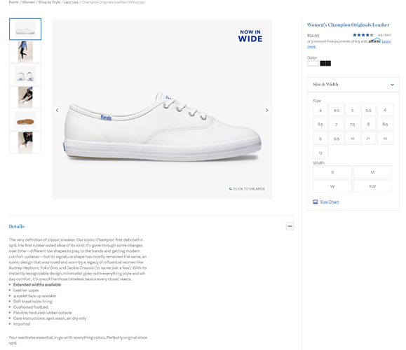
Screenshot from Keds
Keds’ product page for its Women’s Champion Originals Leather shoes is a good example of an informative, content-rich listing. At the top, you’ll see photos of the shoes, complete with a “Click to Enlarge” button on the current image. The page also clearly indicates the exact location on the site, and includes color and size options.
Add well-written copy to the mix, and you’ve got an informative product page that’ll help your sales go up.
Use High-Quality & In-Scale Images
Speaking of images, high-quality product photos can also help with your website UX. With these pictures, you’re helping shoppers know that you’re offering a specific product. We suggest uploading high-definition product photos shot at various angles to emphasize the features of your products.
In-scale images are important, too. Showing your products in their actual sizes will help convince your customers to buy them. In fact, the Baymard Institute found that 42% of shoppers determine product scale and size from photos. Uploading images with your products in real-life settings could help shoppers see how they’ll use those items.
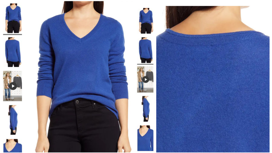
Screenshots from Nordstrom
Nordstrom uses high-quality and in-scale product photos on its site. A clear image of its Halogen V-Neck Cashmere Sweater will greet you once its page loads. And when you move your cursor around the photo, you’ll get a closer look at it.
Prioritize Mobile-Responsiveness
E-commerce purchases from mobile devices skyrocketed to 49.2% in 2020, and that number is expected to increase by 53.9% in 2021. These statistics only show that mobile-responsiveness has become more important than ever in driving sales.
Did you know that failing to make your online store mobile responsive could keep shoppers from browsing it? This could hit your sales in the long run. However, you can avoid it by keeping these mobile UX tips in mind:
- Use a fluid grid to set your site elements to corresponding sizes.
- Design your mobile store for touchscreens.
- Choose the best design elements for small screens. For example, don’t include unnecessary elements and try placing various icons so your customers can see essential links.
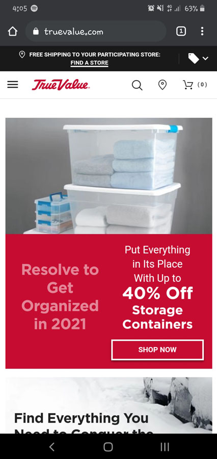
Screenshot from True Value
True Value’s mobile site ticks some, if not all of the mobile design checkboxes we’ve shared. The homepage has simple icons that represent its menu, search bar, and other important links. And when you go down the page, you’ll notice that its design elements fit the screen perfectly. Even the homepage copy shows variety in font sizes.
Provide Timely Customer Support
Many online stores could make you feel like an uninvited guest. This happens when the search for answers to orders, shipping, returns, and more questions are extremely difficult to find. You could have a hard time finding customer support on these sites, as well.
You don’t want your customers to feel like you’re giving them the cold shoulder, though.
Timely customer support can help your website provide better UX. But it can also help you build better relationships with your customers. Prompt responses to a buyer’s problem or concern will satisfy their needs and make them return to your website.
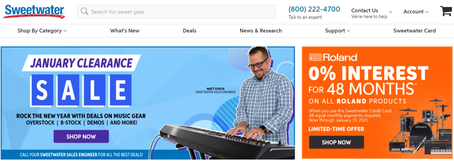
Screenshot from Sweetwater
Showing your contact information on your website is one step toward better customer service. You could start by including a phone number, or a link to a support page. Music retailer Sweetwater, for example, provides their phone number and other customer support channels on its homepage.

Screenshot from HP
Live chat is another excellent addition to your online store. Leveraging this channel lets you address customer queries right away. For example, consider HP’s live chat service, which the brand uses to let shoppers ask about its products.
Include a Clear Call-to-Action
A straightforward CTA encourages your visitors to take action immediately. It directs them to the next step in your sales funnel, whether it’s adding a product to a wishlist or buying an item. Moreover, a clear CTA is vital for conversions. Your sales can grow significantly with a good CTA.
E-commerce stores often use an “Add to Cart” or “Buy Now” button. If you’re using this button, make sure it stands out among your webpage’s other elements. Use contrasting colors and bold text.
As for your CTA’s copy, keep it short and simple. Your copy should tell shoppers that they can buy a product they want by clicking your CTA button. The following phrases are highly effective for CTAs:
- Buy Now
- Check Out
- Add to Cart
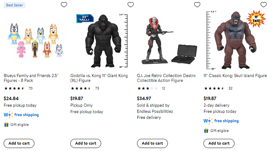
Screenshot from Walmart
Walmart is one E-commerce website that uses an “Add to cart” button for their CTAs. You’ll see this button on the retailer’s category pages, including its Action Figures page.
Stay Ahead of the Competition with a Solid UX Strategy
eCommerce UX is just as important as E-commerce web design, SEO, and other aspects of your digital marketing strategy. It’s all about delivering the best experience possible to your customers. When done right, UX can lead to happy shoppers and more sales for your online business.
Beef up your UX with a well-crafted strategy. Get in touch with Growth Rocket today to set your action plan into motion.
